CONSUMER HEALTH · MOBILE · iOS & ANDROID · ELVIE · 2020
Improving Usability and Confidence in the Elvie Pump App
Senior Product Designer · Elvie · 2019–2020
The Problem
"The controls screen feels busy… I have to check multiple times if my pump is actually working."
New mother
Users weren't struggling because they lacked knowledge. The interface wasn't supporting them when they were exhausted, anxious and distracted.
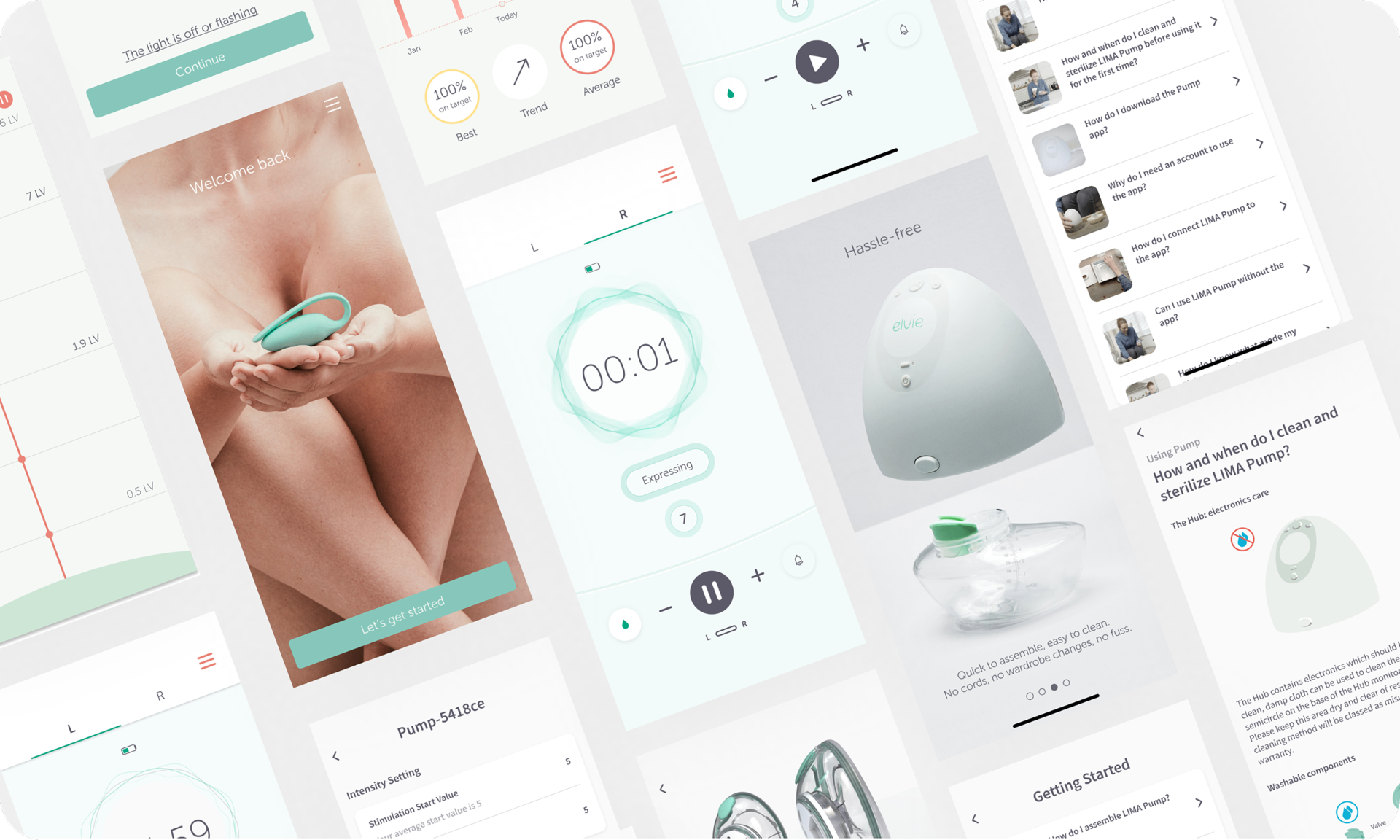
The Elvie Pump app served users across two critical moments: getting started confidently (Home screen), and staying in control while pumping (Controls screen). Both screens were solving the same underlying problem, supporting decision-making when users are tired, distracted or emotionally loaded.
Four primary pain points emerged from user research, usability testing, and high-volume support enquiry analysis. The existing app was functional but outdated, many users, particularly new mothers, struggled with setup and navigation.

Business Context
A 51% confidence score was a brand and retention risk in a competitive consumer health market.
Elvie's brand promise was that technology could make women's health less frustrating and more empowering. The pump app was the primary interface between users and their device. Poor usability damaged brand perception directly and drove customer support volume. In a market defined by peer recommendation and vocal user communities, below-60% confidence was a reputational risk as much as a usability problem.
The redesign also needed to scale across Elvie's expanding product ecosystem, accommodating new devices including Elvie Stride, Curve and Catch, making adaptable information architecture a core design requirement, not an afterthought.
What I Did
Led the UX/UI redesign of the Pump Controls and Home screens end to end.
I collaborated cross-functionally with Product Owners, Developers, Researchers, and Data Scientists. I held regular review sessions to refine information architecture across both screens, developed mid and high-fidelity mockups alongside the Service Designer.
I created animations in Principle for Mac to improve clarity in pump mode transitions, and joined User Researchers to conduct in-person, moderated testing sessions, observing interactions, taking notes, translating findings into design iterations.
I maintained close collaboration with developers during QA, provided detailed Figma specs with interaction behaviours and component guidelines, and iterated the design continuously based on usability testing and data insights. I also onboarded new designers to Elvie's workflow during this period, helping them adapt quickly to the team's standards and processes.
What I Found
Four pain points across two screens, both rooted in the interface not communicating clearly enough.
"I don't understand what mode my pump is in… I'm not sure what the droplet icon means."
Mother of three
- 01
Cognitive overload
Displaying both pumps on one screen created clutter. Users hesitated before adjustments or accidentally adjusted the wrong side.
- 02
Unclear mode indicators
Users couldn't differentiate Stimulation from Expression modes. Many relied on trial and error, a frequent support enquiry trigger.
- 03
Confusing iconography
Arrow icons for switching pump sides were regularly misread as intensity controls. Unlabelled interactions created repeated friction.
- 04
Poor onboarding
New users struggled with initial pump setup, unclear what to do first, no guided flow, no contextual help at the right moment.
How I Designed
From cluttered single-screen to focused, mode-aware pump controls.
The highest-leverage change was the tabbed layout, separating left and right pump controls onto individual tabs instead of displaying both simultaneously. This alone reduced interaction steps by 25% and removed the primary source of cognitive overload.
I redesigned mode indicators to clearly distinguish Stimulation from Expression, aligning the visual language with the physical pump hardware. Inspired by the breast seal, I translated intensity levels into animated sound/suction wave patterns, with text labels displayed on mode change to reinforce the visual.
I developed three animation concepts iterated through user testing. The final concept used a calmer, slower wave, smaller for Stimulation, bolder for Expression, reflecting the physical difference between modes.
Outcomes
Significant confidence and usability improvements, validated through in-person testing.
51 → 94%
user confidence score, up from 51%
62%
fewer support enquiries post-launch
25%
fewer interaction steps on Controls screen
What Shifted
Confidence is an interface communicating clearly when users are at their most stretched.
Mode clarity was the highest-leverage decision. Once users understood which mode they were in, anxiety around using the pump dropped significantly. The 51% to 94% jump wasn't driven by adding features, it was driven by removing ambiguity.
What I Learned
Sometimes clarity requires motion, not just better layout.
The mode indicators were legible in static design but still ambiguous in live use. Testing three animation concepts before settling on the final approach added time, but the animation was what drove the confidence score improvement, not the redesigned layout. Static usability testing does not always surface what only becomes apparent in dynamic, live interaction.
Impact Summary
Redesigned pump controls drove confidence from 51% to 94%, 62% fewer support enquiries related to pump mode confusion, and 30% faster setup.