ACCESS CONTROL · B2B SaaS · LOG MY CARE · 2025
When a Settings Feature Is Really a Safeguarding Problem
Senior Product Designer · Log my Care · May–July 2025 · approx. 2 months
The Problem
Data privacy in care isn't a nice to have. It's a safeguarding requirement, and the system carers used every day had no way to enforce it properly.
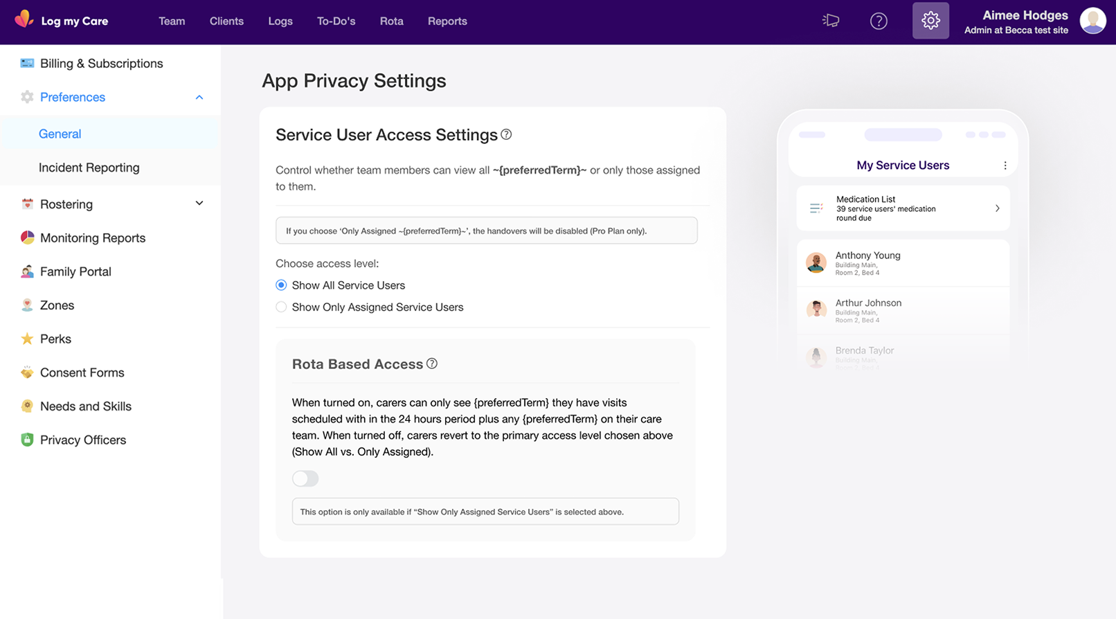
Log my Care is used daily by care teams across CQC-regulated UK settings. In homecare, staffing is rarely static. Providers regularly use agency carers, temporary workers, and non-care staff alongside permanent teams. The existing system gave providers two blunt choices: all carers see all service users, or carers only see service users in their assigned care team. Neither fit the reality of homecare staffing.
In a regulated environment, oversharing sensitive data with agency staff isn't a UX inconvenience. It's a compliance and safeguarding exposure. The feature looked like a toggle. The problem was a trust and safeguarding gap disguised as a settings issue.
Business Context
Winning homecare customers required meeting operational and regulatory needs residential care had never needed to address.
Log my Care was expanding into homecare, a segment with fundamentally different staffing models. Providers evaluating the platform against competitors would reject a system that could not protect service user data from agency and temporary staff. Access control was not a niche feature request. It was a gating requirement for homecare adoption, and getting the design right meant getting the business category right.
What I Did
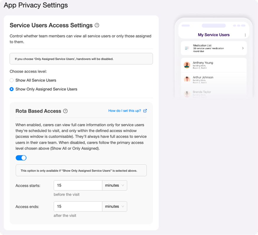
Designed the full four-state access control system from logic through to UI.
I owned the access control logic, the Care Office settings UI, the Carer App experience, the UI copy, and the acceptance criteria. The brief was a four-state access model with time-based visit windows, technically correct, but written to map to system architecture rather than how a care manager thinks about their staff.
Before touching any screen, I reframed the problem around three real staffing scenarios: permanent carers who always need access, agency carers who need access only during a visit window, and non-care visitors who need visit logistics but must never see care information.
I rewrote the UI copy throughout, pushing back on technical language that would have made the settings page unusable for non-technical care managers. Copy in a settings page used by people making consequential configuration decisions is a safety concern, not a polish task.
Pushing back on the copy approach.
The PM's technical description of the feature was precise but written for engineers. When I saw it translated into UI language it was dense, jargon heavy and structured around system logic rather than user decisions. A care manager landing on that settings page would either misconfigure it or avoid it entirely.
I pushed back on the copy approach and rewrote it throughout , settings labels, tooltip content, helper text, anchoring everything in staffing outcomes rather than system states. "Carers can only see service users they have a visit scheduled with, within the time window you set" is usable. A technical description of conditional access state logic is not.
This wasn't a polish call. Copy in a settings page used by non-technical care managers making consequential configuration decisions is a safety concern. Getting it wrong means providers misconfigure access, which means the wrong people see sensitive data, which means safeguarding and compliance exposure.
Before
After
From fixed window to configurable access timing.
My initial design set the access window at a fixed 24 hours before and 24 hours after a visit. The reasoning was straightforward: a consistent window reduced complexity in both the UI and the underlying logic.
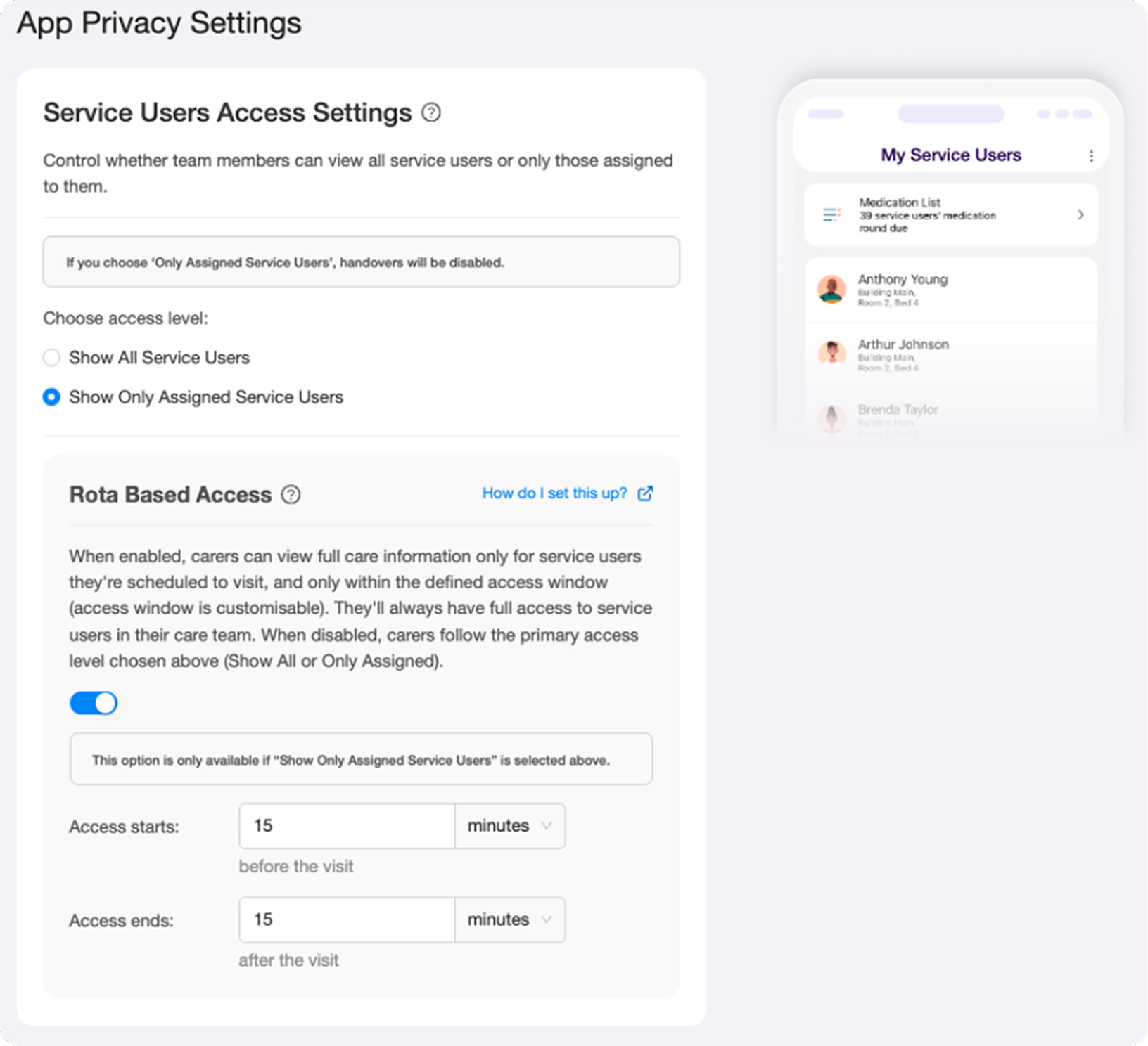
Provider feedback challenged that assumption. Care settings vary significantly. A 15 minute medication visit doesn't need the same window as a complex multi-hour care session. Managers wanted control over the timing, not a system-defined default.
I redesigned to make the window configurable, managers set their own access start and end values relative to the visit. The fixed assumption was replaced with fields that defaulted to a sensible starting point but gave providers the flexibility their staffing models actually required. The added UI complexity was justified by genuine user need.
Initial Design
Design Post-Feedback
What I Found
The hardest design problem wasn't the logic, it was silent misconfiguration.
The four-state access model was technically correct. But the wrong copy, wrong label, or wrong information hierarchy would leave care managers configuring the wrong thing with confidence. The risk wasn't confusion. It was confident misconfiguration in a regulated care environment.
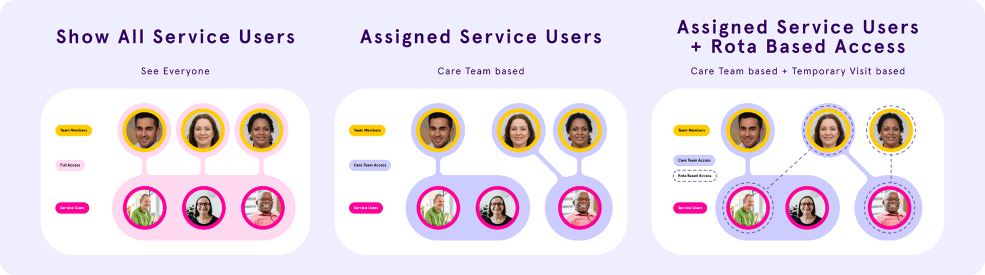
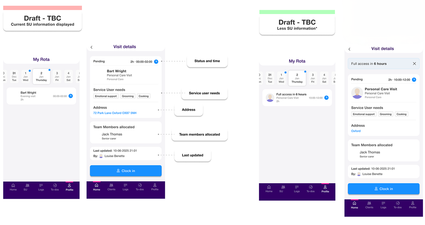
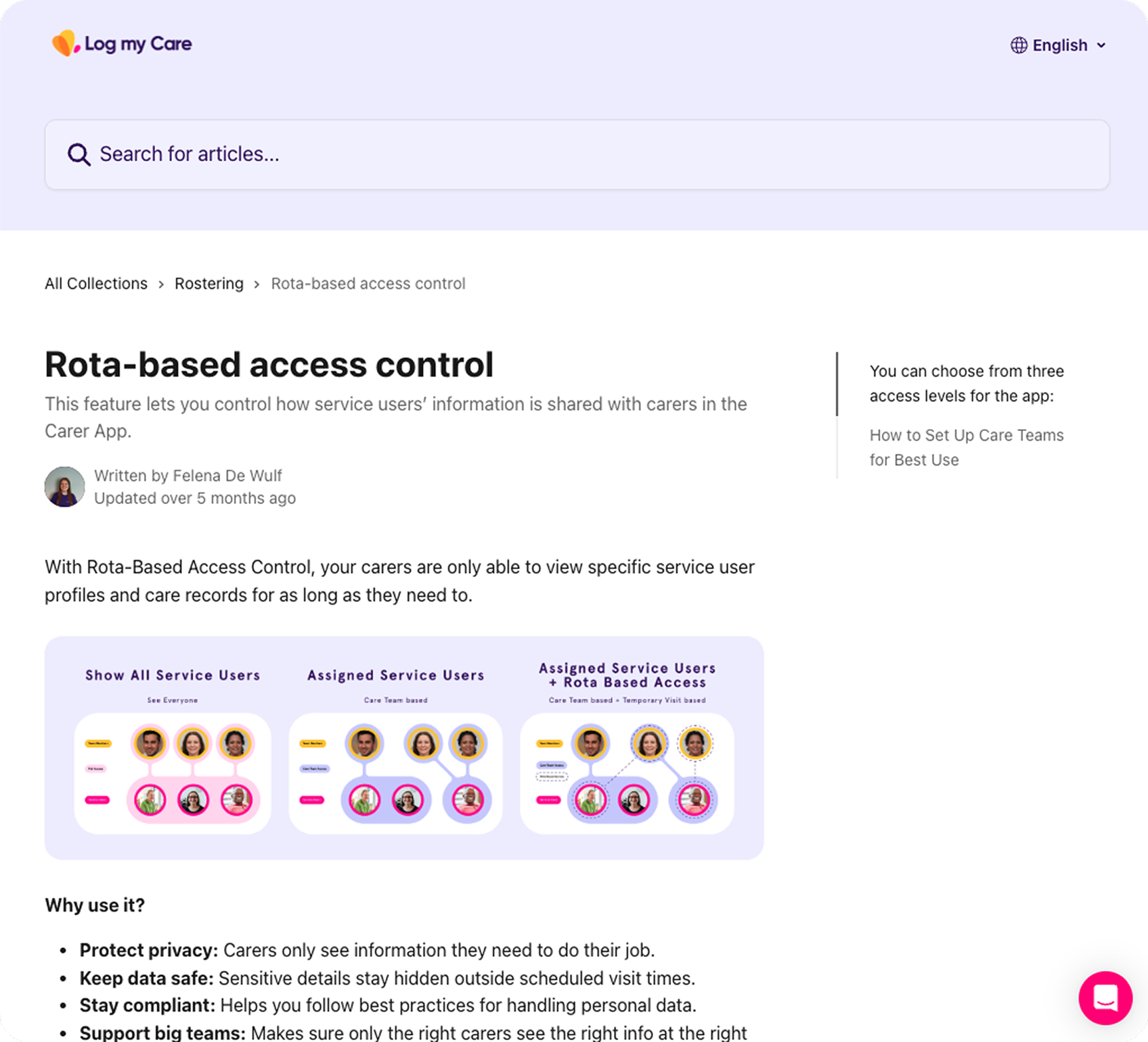
The model splits into two configurations: homes without rota functionality (two states) and homes with rota enabled (two additional states controlled by a toggle).
- 01
The four access states
Full access; care team only; care team plus rota-based window for agency carers; care team only with rota OFF for non-care visitors.
- 02
Configurable time window
Initial design fixed the access window at 24 hours. Provider feedback showed care settings vary significantly. I redesigned to make the window configurable.
- 03
The address decision
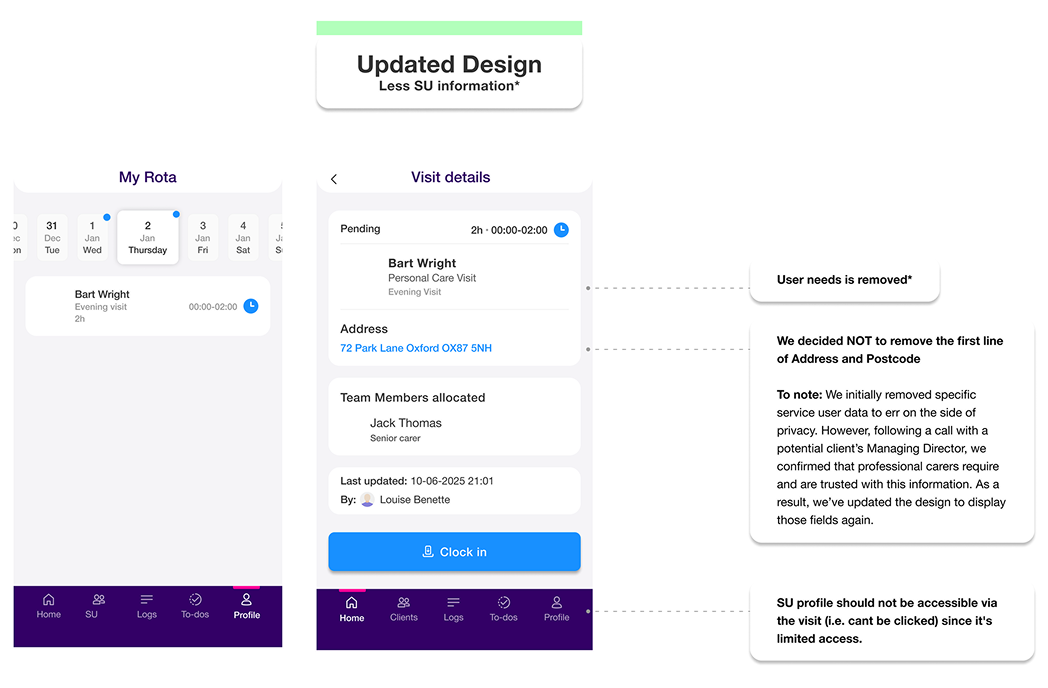
I initially removed address from the limited-access screen. A discovery call challenged this: carers need an address to get to a visit. The right distinction is operational necessity versus clinical sensitivity.
- 04
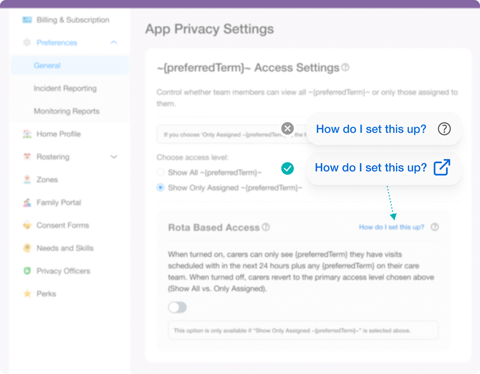
Tooltip vs link pattern
The original design used a tooltip icon to trigger a support article link. I replaced it with an explicit 'How do I set this up?' text link, preventing pattern confusion in a time-pressured settings UI.
How I Designed
This wasn't a settings feature. It was a staffing model problem that needed a settings feature.
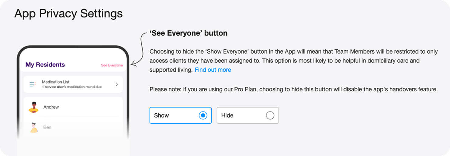
Designing from the three staffing scenarios rather than the four preference states meant every UI decision had a clear human context behind it. The settings page could help care managers self-identify their situation, rather than asking them to decode technical options.
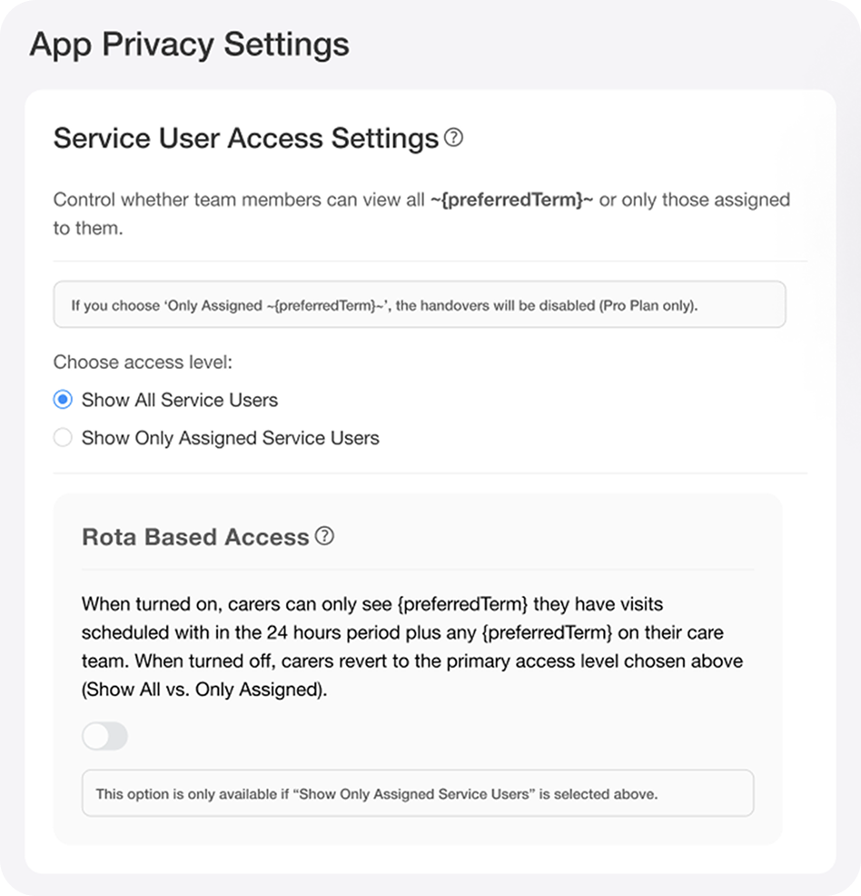
The conditional logic between controls was important to get right visually: the Rota Based Access switch is only available when "Show Only Assigned Service Users" is selected. That dependency had to be legible without requiring an explanation.
Correcting a misleading UI pattern.
The original design used a tooltip icon to trigger a support article link. Tooltip icons signal contextual information, not navigation, this misrepresented the interaction. I replaced it with an explicit "How do I set this up?" text link, which accurately communicates that it opens an external page. Pattern consistency matters in a settings UI where care managers are under time pressure and can't afford to misconfigure access.
Design iteration, before and after the discovery call.
My initial design removed the full address to err on the side of privacy. Following a discovery call with a potential client's Managing Director, we confirmed that professional carers need and are trusted with address information to physically reach a visit. I updated the design to restore the address field, while keeping other sensitive service user details restricted.
Before
After
Outcomes
A privacy first access control system built around how homecare actually staffs.
I left at the close of the design phase, before release. The foundation I delivered was: a four-state access model mapping directly to real staffing scenarios, settings UI navigable by non-technical care managers, Carer App behaviour defined across all four states, and copy rewritten to describe outcomes, not mechanisms.
4 states
access model mapping to real homecare staffing
2 surfaces
Care Office settings + Carer App cohesively designed
NDA
full designs available on request
From design decisions to shipped documentation.
The copy approach carried through to the shipped support article , plain language, outcome focused, written for care managers not engineers.
What I'd Measure Next
Measuring what matters in a safety critical settings feature.
I left at the close of the design phase before release, so post launch data isn't available to me. If I'd stayed, I'd have tracked: rate of settings misconfiguration through support tickets related to unexpected access behaviour, care manager confidence in configuring access through follow up interviews, reduction in data access complaints or safeguarding incidents related to agency carer visibility, and whether rota based access was adopted by the homecare segment it was designed for and at what rate.
What Shifted
Complexity at the logic layer has to be absorbed by design, not exported to users.
The spec was correct. The first copy pass was correct. Neither was usable. In B2B products used by non-technical users making consequential configuration decisions, copy is infrastructure. A misconfigured access control setting in a regulated care environment isn't an inconvenience, it's a risk.
What I Learned
The best access control design asks what information is necessary, not just what is sensitive.
My first instinct on the limited-access visit screen was to restrict everything beyond the minimum. A discovery call with a Managing Director reframed it: carers need an address to physically reach a visit. Privacy and usability are not always in opposition. The right question is operational necessity versus clinical sensitivity, not blanket restriction versus full access.
Impact Summary
Designed a four-state, rota-aware access control system giving non-technical care managers precise control over which carers can access service user data and when.