MOBILE · SURGICAL EDUCATION · TOUCH SURGERY · 2018
From 100K to 2M Users: Redesigning Surgical Training for Mobile
UI/UX Designer · Touch Surgery (now Medtronic) · 2017–2018
The Problem
The app had been built by a small team during the company's early start-up phase. As the user base grew, it became clear a fundamental rebuild was needed.
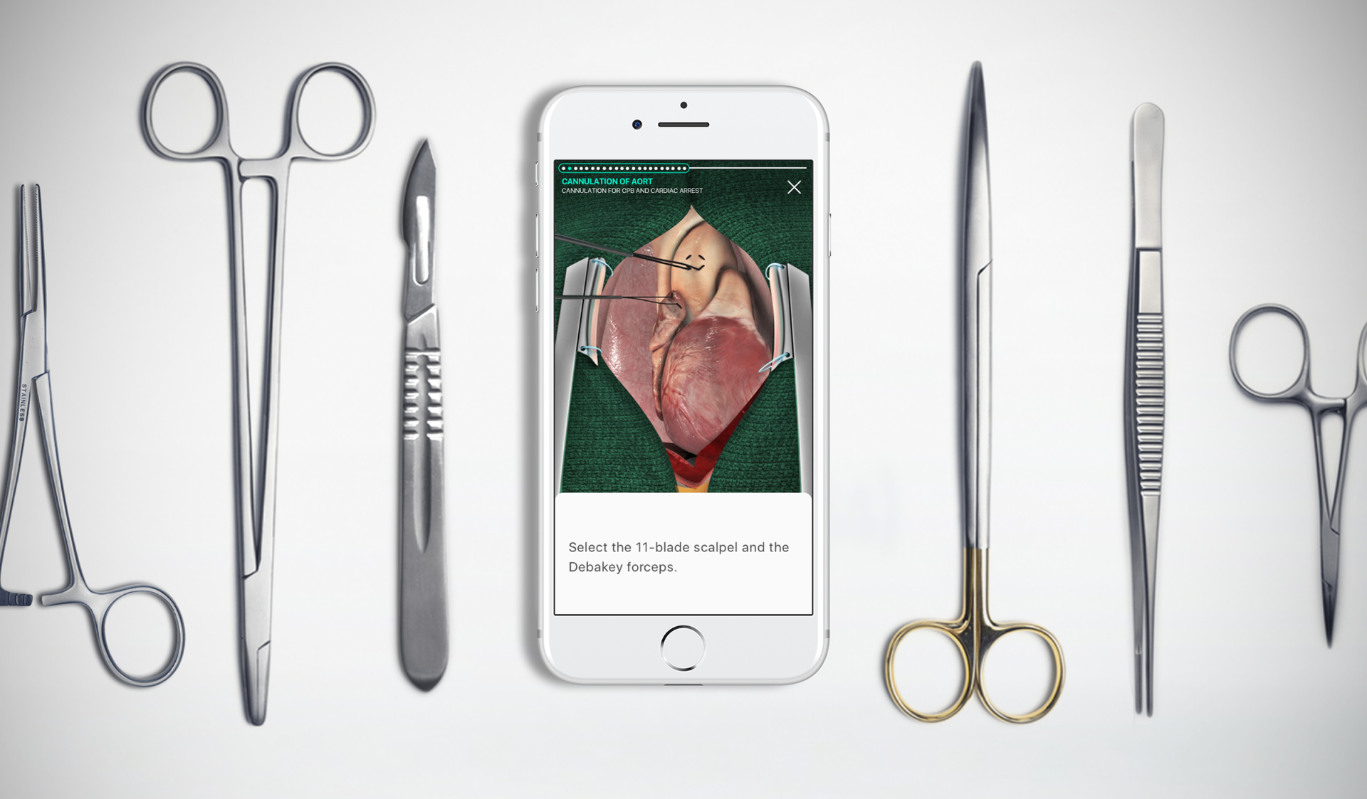
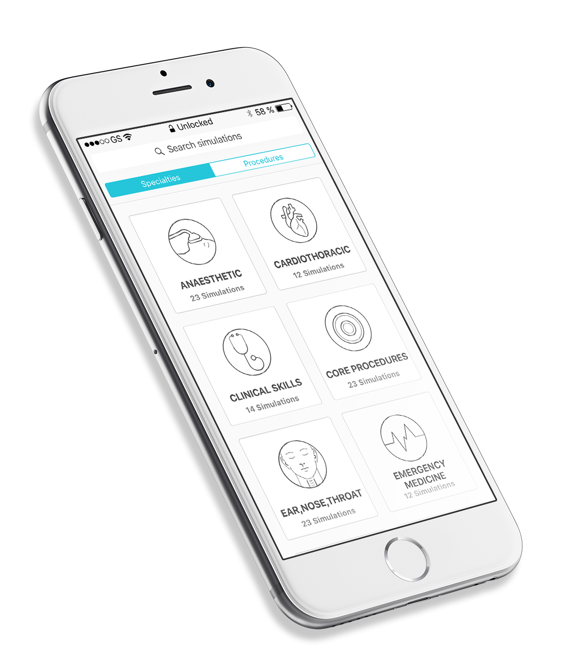
The existing Touch Surgery app had been designed to showcase surgical animation content in the company's early days. As the user base scaled, the limitations became critical: high drop-off, frequent crashes, misalignment with platform guidelines, and an experience that wasn't holding the attention of resident surgeons.
The goal was to deliver an enhanced, engaging and enjoyable app experience for surgeons, accessible anytime, anywhere, including in hospital environments where connectivity is unreliable.
Business Context
Hospital and residency program adoption required a product that could perform in clinical environments.
Touch Surgery's commercial model depended on training directors choosing to integrate the app into surgical curricula. This required a product that functioned reliably in hospital networks, met the expectations of technically demanding surgical residents, and supported programme directors' learning objectives. High drop-off and frequent crashes were not just usability problems. They were commercial barriers to institutional adoption at scale.
What I Did
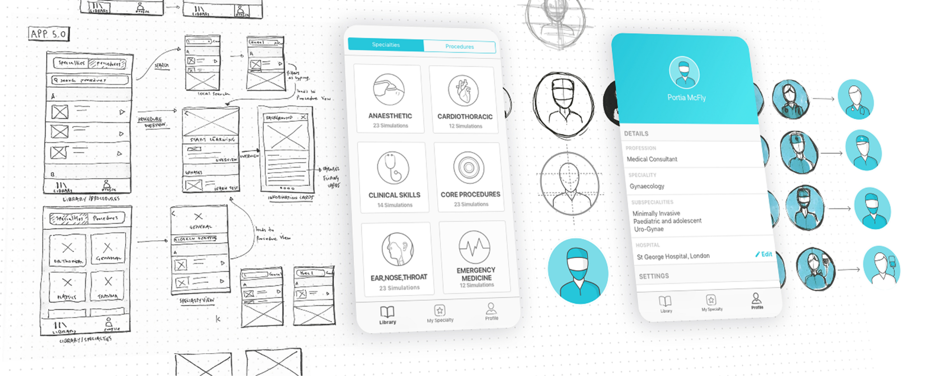
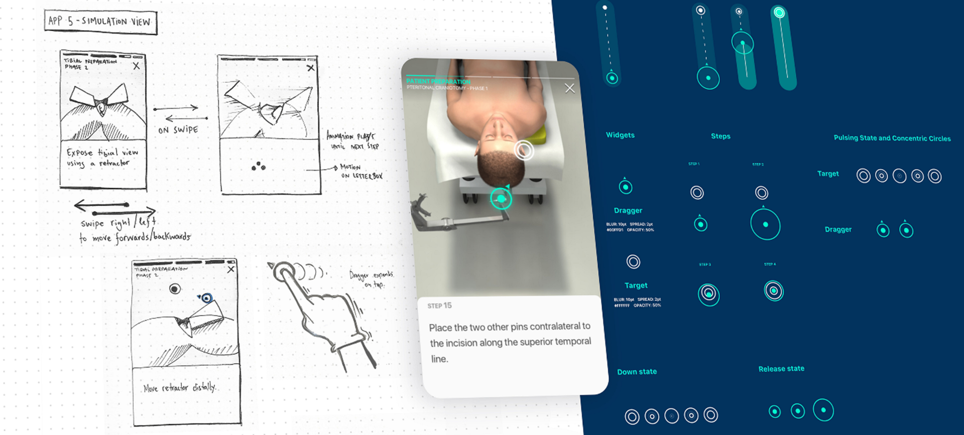
Contributed to the end-to-end redesign across iOS and Android, from wireframes through to shipped product.
I collaborated with the User Researcher to conduct user testing on features throughout the redesign. I developed and refined wireframes and user journeys across the app, created both low and high-fidelity prototypes, and delivered designs at pace to support agile sprint cycles.
One of the most valuable parts of the process was visiting resident students and surgeons in London hospitals for direct face-to-face feedback. Watching where users hesitated and listening to them in real time surfaced insights that remote testing couldn't.
I created and maintained style guides for iOS and Android, provided assets and design direction for engineering, and kept engineers informed ahead of each sprint with upcoming features and design rationale.
What I Found
Six interconnected problems, all rooted in an app that had outgrown its original design.
- 01
High drop-off
Users abandoned at simulation start or load, the most critical engagement moment for a learning tool.
- 02
Platform misalignment
No adherence to Material Design (Android) or Apple HIG (iOS), producing two inconsistent, unclear experiences.
- 03
Frequent bugs and crashes
A problematic codebase meant frequent crashes that frustrated surgical residents with very limited time.
- 04
Inconsistency and poor usability
Lack of visual consistency, unclear navigation, and poor usability across the app created friction at every learning stage.
- 05
Low engagement
The app wasn't engaging enough as a learning tool for the most time-pressured users in medicine.
- 06
Multi-device problems
Performance degraded across different devices and screen sizes, limiting accessibility for a global, mobile-first user base.
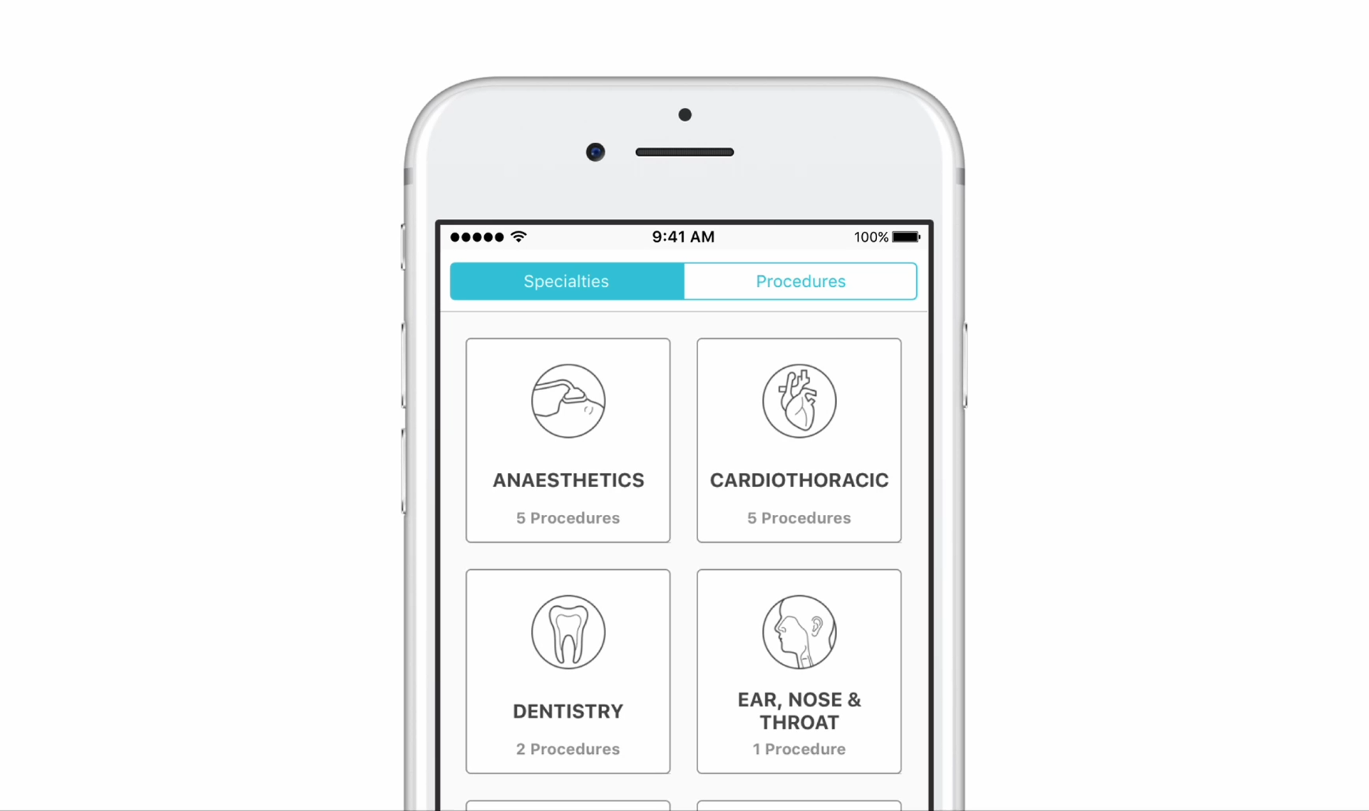
How I Designed
Iterative, user-validated redesign built around surgical residents' real constraints.
The redesign addressed both experience and infrastructure. Offline content download was essential, surgeons often can't load content reliably inside hospital networks. Platform guidelines compliance brought the app in line with what users expected from native apps.
Cognitive load reduction was a constant lens: removing unnecessary features, rethinking required ones, focusing on what surgical residents genuinely needed. Every screen was tested face to face in hospital settings before progressing to high fidelity.
Outcomes
From a startup proof of concept to a globally adopted surgical training platform.
100K → 2M+
users post-redesign
160+
surgical residency programs adopted worldwide
500%
increase in monthly engagement
Adopted by Harvard Medical School, Stanford Medicine, Johns Hopkins, and Mt Sinai Health System.
What Shifted
Engaging the most demanding users in medicine requires getting every detail right.
Surgical residents have almost no tolerance for friction. When a simulation fails to load or an interface is unclear, they don't troubleshoot, they leave. The redesign succeeded not because of a single feature, but because it addressed the experience end to end.
What I Learned
In-person hospital testing revealed what no remote session could.
Watching surgeons use the app between shifts, on mobile, under time pressure, in an actual hospital environment, surfaced design decisions no remote session could have produced. The context of use was inseparable from the usability problems. I'd prioritise field research in the genuine environment of use earlier and more deliberately in future projects where the use context is this distinctive.
Impact Summary
The redesigned app grew from 100,000 to 2 million users with a 500% increase in monthly engagement, adopted by 160 surgical residency programs including Harvard, Stanford Medicine, and Johns Hopkins.