CLINICIAN PLATFORM · STRYKER · 2023
43% Less Admin Time: Patient Registration Redesign for Busy Clinicians
Senior Staff UX/UI Designer · OrthoLogIQ (Stryker) · August – October 2023 · 4 sprints
The Problem
"The current process feels overwhelming. Too many fields crammed into one page, easy to lose track, easy to make mistakes, especially in a rush."
, Dr. Patel, Clinician
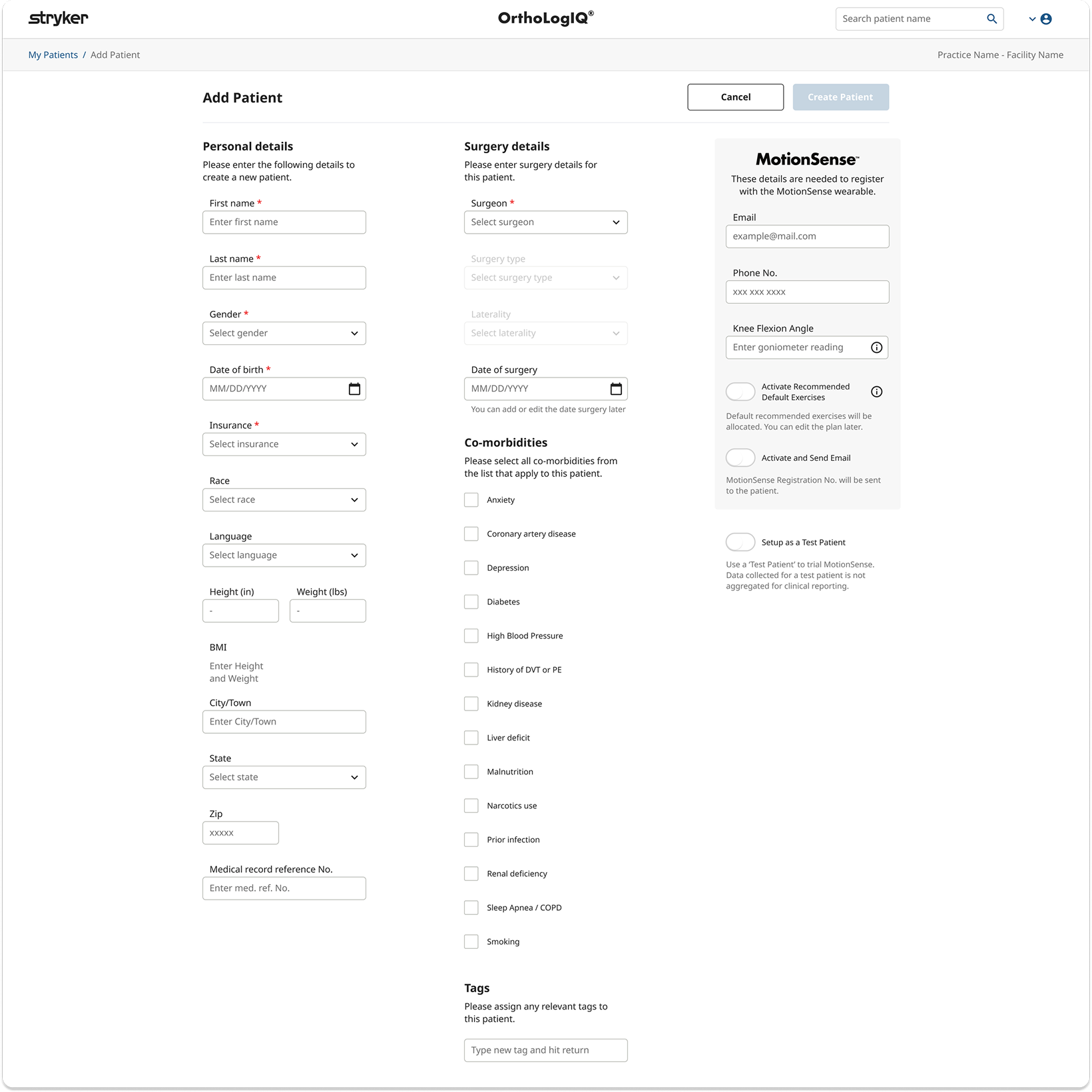
The existing Add Patient screen on OrthoLogIQ crammed all fields into a three-column single-page layout, requiring excessive scrolling and making it easy to miss or mis-enter data under pressure. Clinicians in busy healthcare environments reported cognitive overload, with task completion taking 5 minutes or more when it should take under 2.
The Edit Patient screen replicated the same layout, despite being a fundamentally different task: targeted correction, not guided data entry. The same design solution was serving two completely different user needs.
Business Context
Five-minute data entry per patient was a direct barrier to practice adoption and renewal.
OrthoLogIQ competed within surgical practices where clinician time is acutely constrained. Workflows taking five or more minutes created friction that discouraged usage and justified switching. Reducing administrative burden was simultaneously a usability improvement and a commercial retention lever: practices that found the platform efficient expanded usage, practices that found it inefficient contracted it.

What I Did
Redesigned both Add Patient and Edit Patient flows with a step by step wizard and tabbed layout.
Without a dedicated research team, I conducted informal interviews and live observations with clinicians over video calls. These real time sessions gave me insight into their mental models and where the current design created friction , even a small number of observations surfaced the key structural problems clearly.
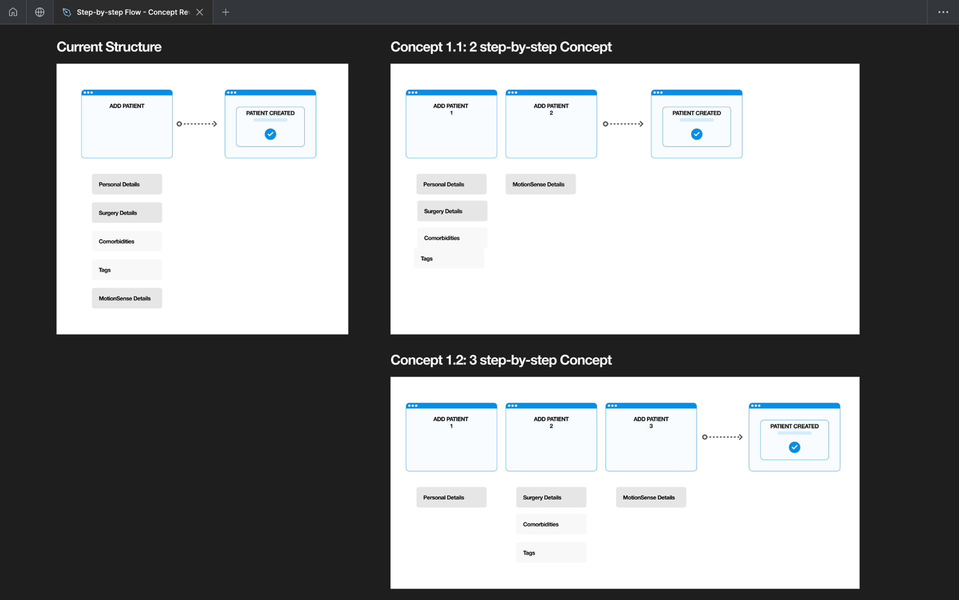
I created multiple layout concepts (2-step and 3-step flows) for stakeholder review. A key structural decision: the existing success modal was a dismissal risk at the most critical moment. I repurposed it as a dedicated third step, a summary and confirmation screen, giving clinicians an unhurried view before submission.
I worked closely with Engineering from the start to align on Angular Material's stepper component, saving build time. I defined analytics custom events for Azure dashboard tracking and delivered detailed flow documentation covering every interaction, edge case, and unhappy path.
What I Found
The same layout was failing two fundamentally different tasks.
Four core problems shaped the design approach. The first two were about the workflow itself, the second two about navigating real project constraints.
- 01
Cognitive overload
Clinicians spent 5+ minutes on a task that should take under 2. All fields crammed into three dense columns required excessive scrolling just to locate the right field, no structure, no guidance, easy to miss or mis-enter data under time pressure.
- 02
Modal dismissal risk
The success modal could be dismissed before confirmation details were registered. In a high-pressure clinical environment, this created real risk of missed information at the most critical moment.
- 03
Add vs Edit mismatch
Add Patient (guided data entry) and Edit Patient (targeted correction) are fundamentally different tasks. Applying the same step-based wizard to both was the wrong solution for editing.
- 04
Dev and sprint constraints
Some directions conflicted with existing UI components and sprint timelines. Early alignment with Engineering on Angular Material's stepper prevented rework and kept delivery on track.
How I Designed
Three steps for Add Patient. Two tabs for Edit Patient. One dedicated confirmation moment.
Add Patient: 3-step wizard
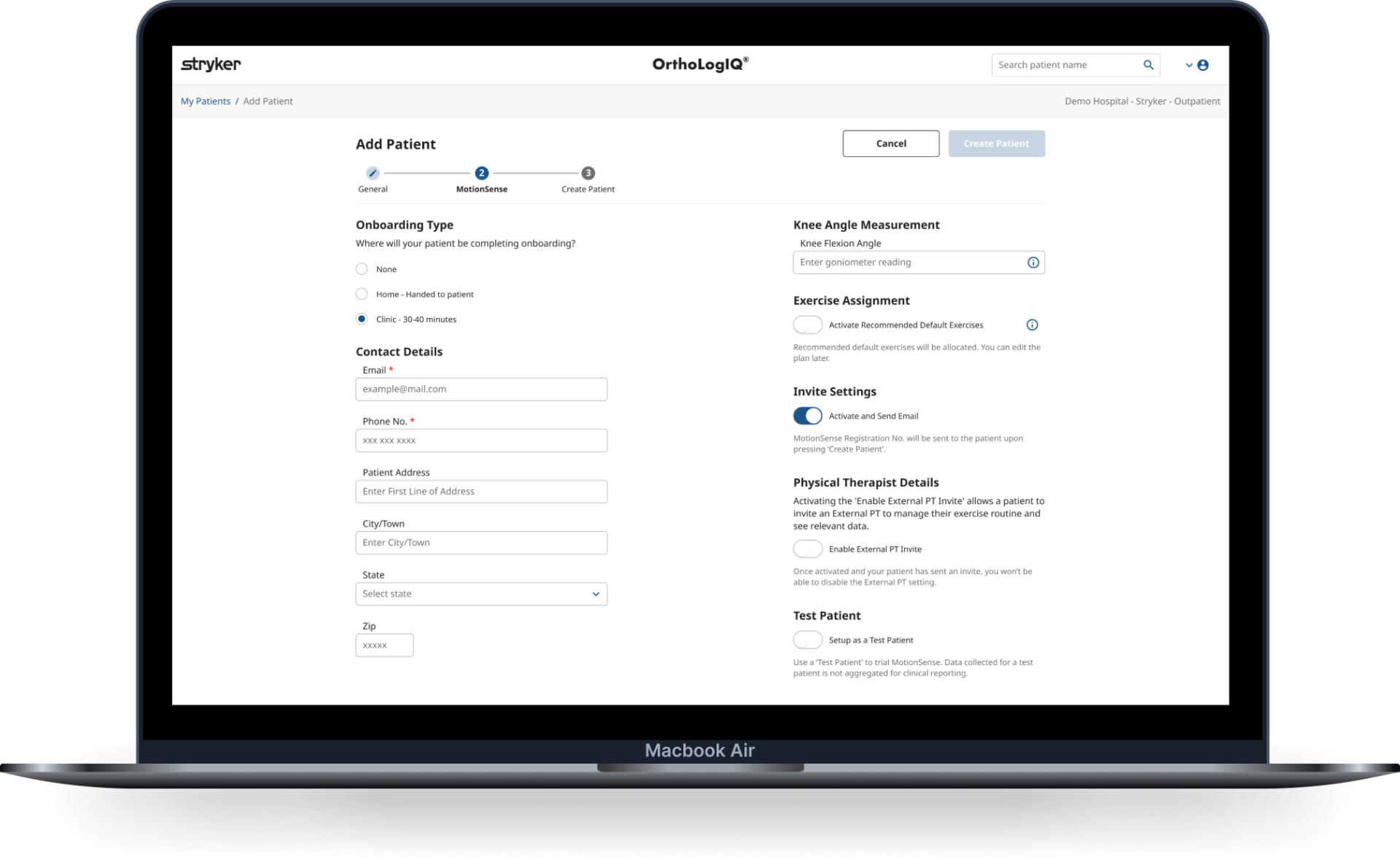
Step 1, General (Personal + Surgery Info). Step 2, MotionSense (Wearable Setup). Step 3, Create Patient (Summary + Confirmation). Each step has clear guidance and inline validation.
Edit Patient: tabbed layout
Editing is targeted correction, not guided entry. A simpler two-tab interface (General | MotionSense) gives direct access without the overhead of a step-based flow.
Confirmation step, not modal
Repurposed the dismissable success modal into a dedicated wizard step, giving clinicians an unhurried view of what was created before they commit.
Unhappy paths mapped
Proactively mapped edge cases including onboarding type misselection, incomplete data entry, and step requirement confusion, with inline validation and clear recovery paths.
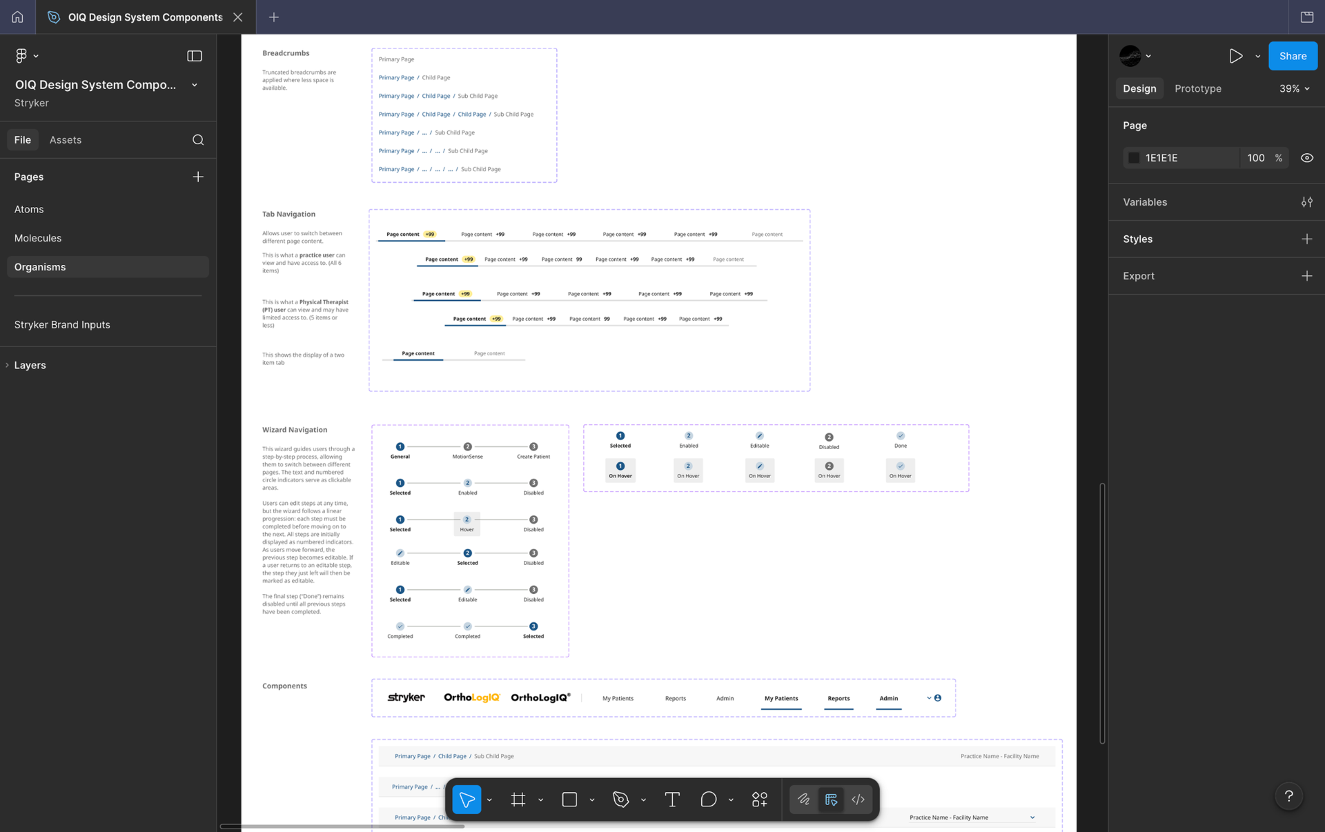
Design system contribution
New components introduced for this feature, the wizard stepper, validation states, and confirmation step, were documented with full states, variants and interaction specs in Figma, keeping the OIQ Design System consistent and giving Engineering a self-explaining handoff reference.
Step structure iteration
Early concepts explored a two step and three step structure. Clinician feedback showed separating Personal and Surgery Details created unnecessary fragmentation. I merged them into a single General step, keeping MotionSense distinct due to its wearable setup complexity.
Clinician feedback sessions
Without a dedicated research team, I ran informal interviews and live observations over video calls with clinicians. Even a small number of sessions surfaced the key structural problems clearly and validated the direction before moving to high fidelity.
Edit Patient concepts explored
Three wireframe concepts were developed and tested: three column, two column, and a visual tabbed approach. Developer feedback confirmed the tabbed layout aligned best with existing component libraries, reducing build complexity within the sprint timeline.
Refining the step structure based on clinician feedback.
Early wireframes explored a three step structure: Personal Details, Surgery Details, and MotionSense. Clinician feedback highlighted that separating Personal and Surgery information created unnecessary fragmentation, they were comfortable scrolling through related fields as long as content was clearly structured. I merged Personal and Surgery into a single General step to reduce cognitive load, while keeping MotionSense as a distinct second step due to its unique wearable setup requirements and technical constraints.
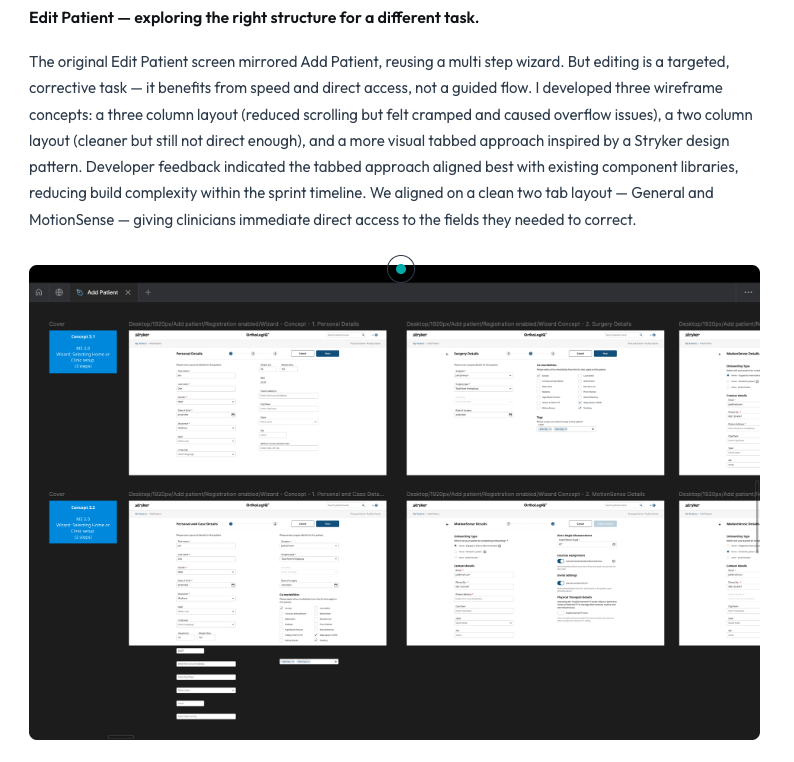
Edit Patient, exploring the right structure for a different task.
The original Edit Patient screen mirrored Add Patient, reusing a multi step wizard. But editing is a targeted, corrective task , it benefits from speed and direct access, not a guided flow. I developed three wireframe concepts: a three column layout (reduced scrolling but felt cramped and caused overflow issues), a two column layout (cleaner but still not direct enough), and a more visual tabbed approach inspired by a Stryker design pattern. Developer feedback indicated the tabbed approach aligned best with existing component libraries, reducing build complexity within the sprint timeline. We aligned on a clean two tab layout , General and MotionSense, giving clinicians immediate direct access to the fields they needed to correct.
Component decisions and design system.
Engineering suggested adopting Angular Material's stepper component rather than building custom. I evaluated it against the design intent and made a deliberate call to adopt it, it aligned closely with my direction and freed sprint capacity for the parts that actually differentiated the experience: the confirmation step, validation patterns, and edge case handling. I also explored progress indicator placement (top of page vs below the title) before landing on the final position, matching it to Stryker brand guidelines. New components were documented with full states, variants and interaction specs in Figma, keeping the OIQ Design System consistent and giving Engineering a self-explaining handoff reference.
Shipped Add Patient wizard.
The final shipped flow, step 2 (MotionSense) of the wizard running on the OrthoLogIQ platform.
Outcomes
Clinicians completing entries faster, with more confidence and fewer errors.
3 → 1.7 min
task time, a 43% reduction
Fewer errors
from step structure, inline validation and clear confirmation
WCAG
across colour contrast, keyboard nav, and cognitive load
What Shifted
The same structure failing two different tasks was the root problem, not the individual screens.
Add Patient and Edit Patient are different tasks that need different solutions. Once that distinction was clear, the right structure for each became obvious. The step-based wizard was right for guided data entry under pressure. The tabbed layout was right for targeted, fast correction.
What I Learned
Adopting existing component libraries earlier frees capacity for what actually differentiates the design.
Exploring custom component options before committing to Angular Material's stepper took time that could have been spent on the confirmation step, validation patterns, and edge case handling , the parts that actually made the experience better. I'd make the build-versus-adopt decision with Engineering in the first sprint, not after wireframes are in progress. I also defined custom Azure analytics events to track post-launch behaviour , Step 2 showed higher exit rates after launch, giving the team a clear data signal for the next sprint iteration.
Impact Summary
Reduced clinician patient data entry time by 43%, from 3 minutes to 1.7 minutes, by replacing a cluttered single-page form with a guided step-by-step wizard.