AI · CONVERSION · B2B2C · HEALTHILY / WALMART · 2021
Increasing Conversion with Walmart's AI Symptom Checker
Product Designer · Healthily x Walmart Medicine Cabinet · 2021
The Problem
Users couldn't tell the difference between cold, flu and COVID. When they couldn't, they didn't buy anything.
Walmart's Medicine Cabinet lacked clear guidance. Users struggled to differentiate between cold, flu, and COVID-19, leading to decision fatigue. The journey had no symptom-based recommendations and too many product choices, with no clear path from symptom to the right purchase.
Primarily serving females aged 35 to 55, 70% of Walmart shoppers, the tool needed to feel fast, trustworthy and medically credible.
Business Context
This was Healthily's route into the US market and Walmart's route to Health and Wellness basket growth.
Healthily's partnership with Walmart was a significant commercial contract. A symptom checker embedded in Walmart's Medicine Cabinet connected Healthily's clinical content engine to Walmart's US shopper base. Landing page conversion of approximately 10% was the primary commercial failure. Improving it was the business case for the entire design investment: every percentage point gained corresponded directly to OTC product engagement and basket size.
What I Did
From brief to live, data-validated product in 3 months.
I joined when initial flows had been created by the Product Owner and Medical Team but lacked UX input. I reviewed and refined the proposed user journey, created mid-fidelity wireframes, then developed high-fidelity designs for both mobile and desktop.
I worked closely with Product Owners, UX Researchers, and the Medical Team throughout. I contributed to A/B testing post-launch and led the exit survey analysis that drove the most significant conversion improvements.
What I Found
Four interlocking pain points blocking conversion.
Research and usability testing identified four primary pain points. These were not isolated: symptom confusion fed into poor navigation, which compounded trust and engagement problems across the journey.
- 01
Symptom confusion
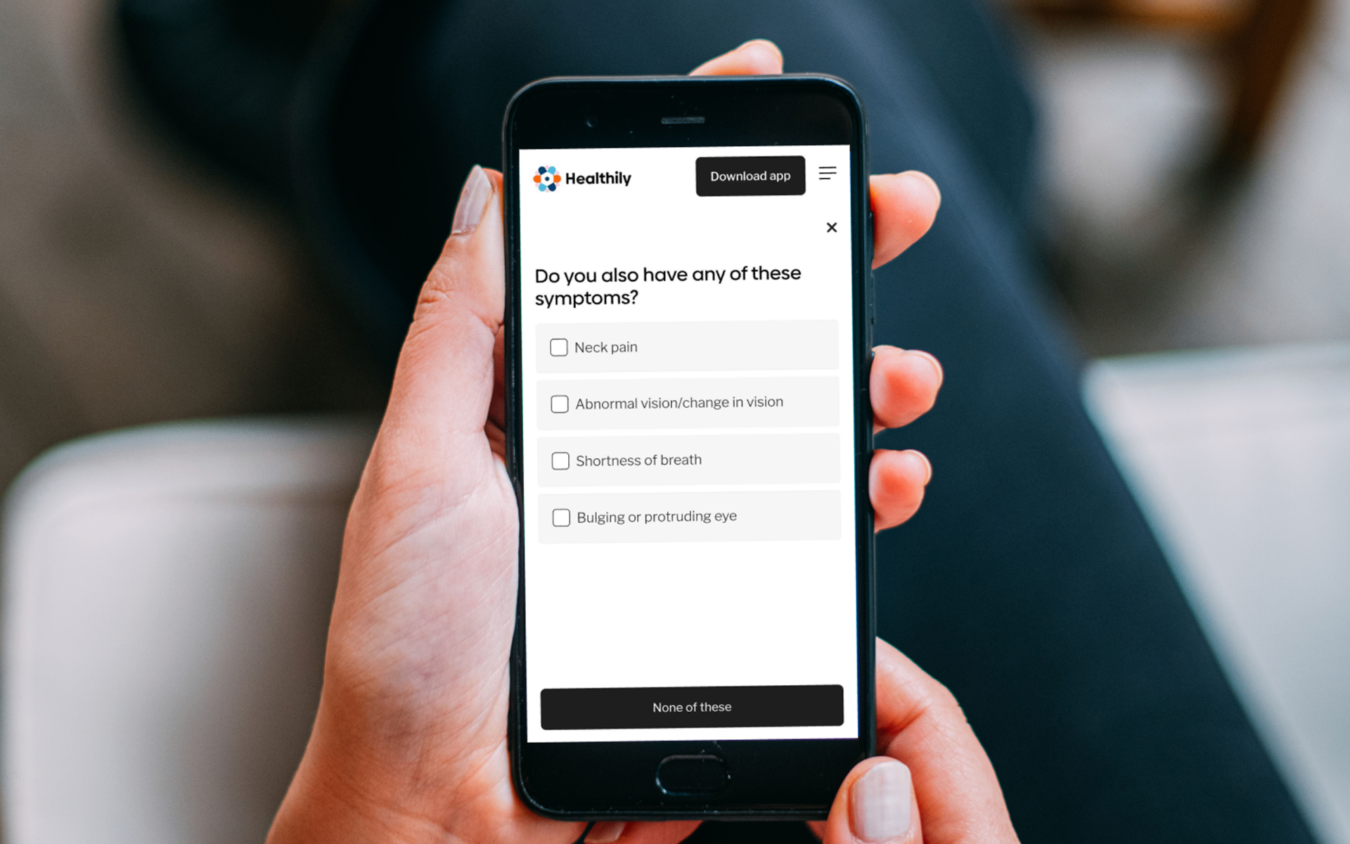
Users couldn't differentiate cold, flu and COVID-19. Defaulting to worst-case self-diagnosis created hesitation and drop-off before any recommendation was reached.
- 02
Unclear navigation
The checker flow felt unintuitive and longer than expected. Without knowing how long it would take, users dropped off early.
- 03
Limited trust
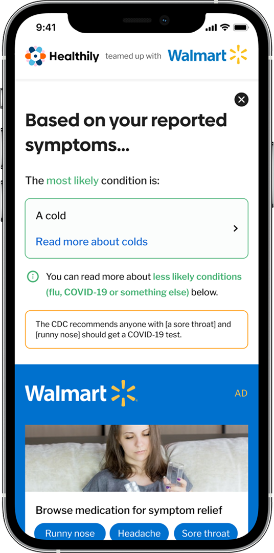
Users were unsure whether product recommendations were medically reliable. Lack of visible credibility signals reduced confidence.
- 04
CTA confusion
33% of users who exited the landing page did not intend to leave Walmart.com. The CTA failed to communicate the transition to an external tool.
How I Optimised
Exit surveys revealed what A/B testing alone couldn't.
A/B testing showed Variant B significantly outperformed baseline: conversion jumped from ~10% to ~55%. Key changes: simplified copy, repositioned trust signals, CTA colour changed to blue, and an upfront time estimate added.
Exit survey analysis exposed the root causes behind remaining drop-off. Each finding had a direct design response:
Time expectations
45% of exiting users cited 'not clear how long this takes.' Added an upfront time estimate to set expectations before users committed.
CTA confusion
33% said 'I didn't mean to leave Walmart.com.' Updated CTA messaging explicitly communicated the transition to an external tool.
Trust signals
10% cited lack of trust. Strengthened Walmart partnership branding and made medical verification more prominent.
Low urgency
12% were curious but not ready, identified as a remarketing opportunity, not a usability failure.
Outcomes
Live product, validated by data.
10 → 55%
landing page conversion after A/B testing
~45%
drop off reduction from exit survey led changes
3 months
MVP delivery from brief through launch
What Shifted
From missed conversions to a tool people used, shared and trusted.
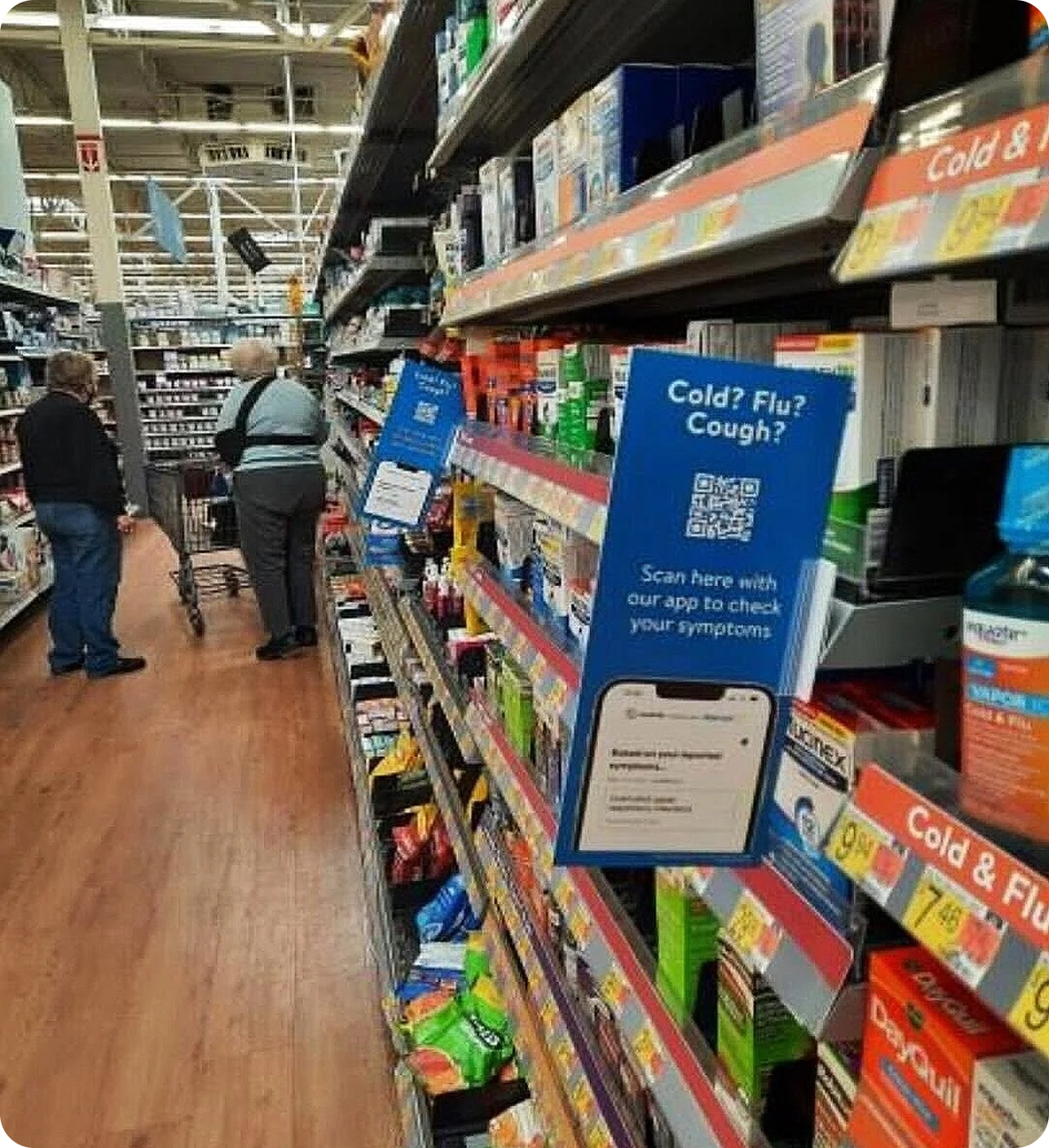
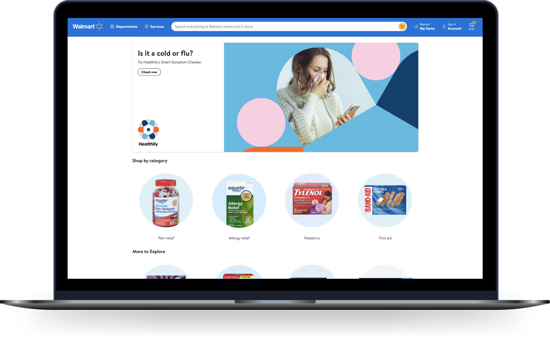
The product launched in Walmart's Medicine Cabinet, reaching thousands of American users. It was also promoted in stores via QR cards. Post-launch, continuous A/B testing and exit survey iteration kept improving the experience.
What I Learned
Exit surveys are more valuable than A/B testing alone for diagnosing conversion failure.
A/B testing showed what improved. Exit surveys explained why, and that explanation drove the second meaningful round of changes. I'd make exit survey analysis a default post-launch instrument on any conversion-focused product, run in parallel with quantitative data from launch rather than as a follow-up only after the numbers raise questions.
Impact Summary
A/B testing drove landing page conversion from ~10% to 55%; exit survey analysis then delivered a further ~45% drop-off reduction by surfacing the root causes behind remaining abandonment.